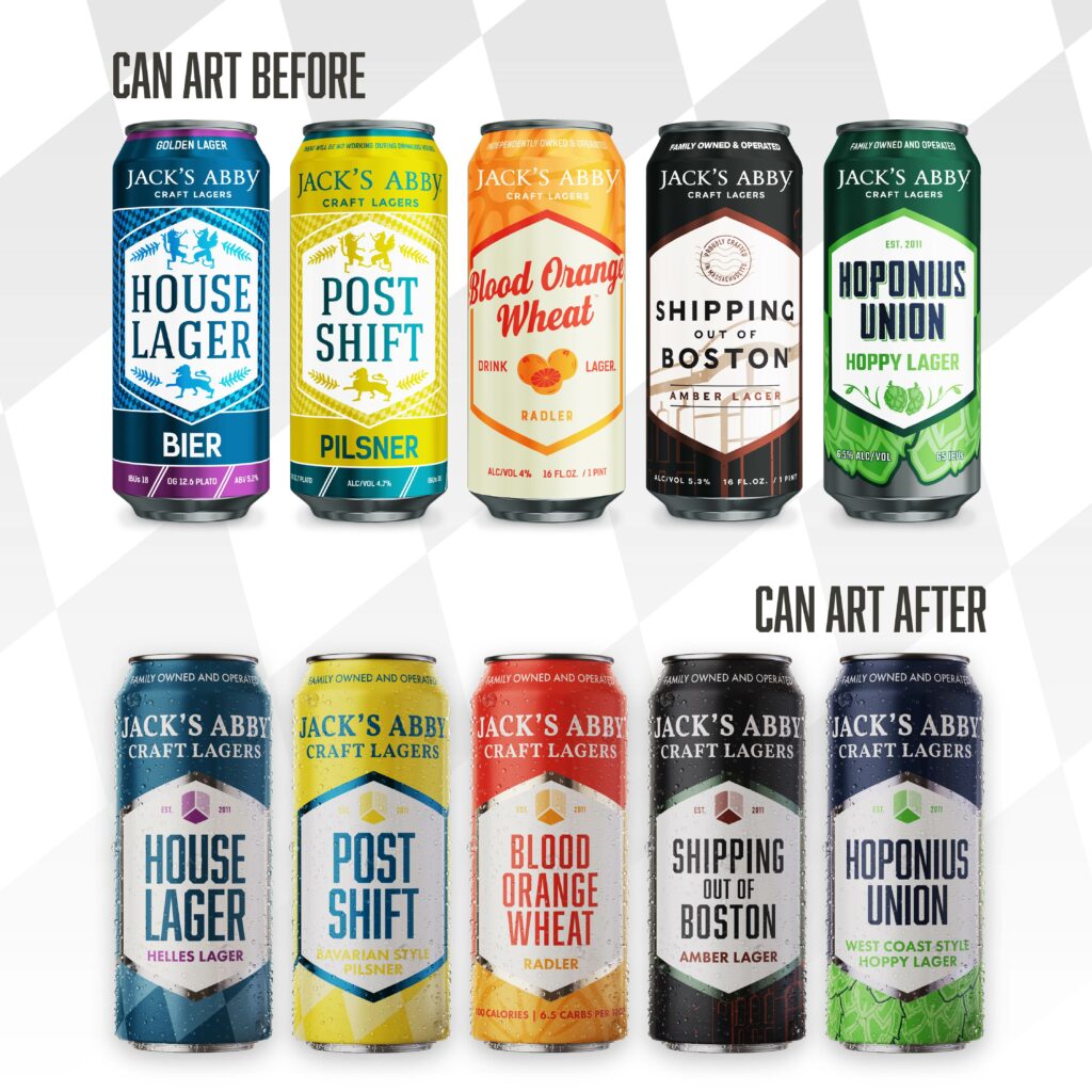
We set out on this brand refresh project at the beginning of 2022 with the goal of delivering a fresh new look that takes the best of our past and modernizes the look in a vibrant and compelling way for our future. You’ve been part of the process along the way, and today we can finally reveal the most exciting piece – the new packaging!
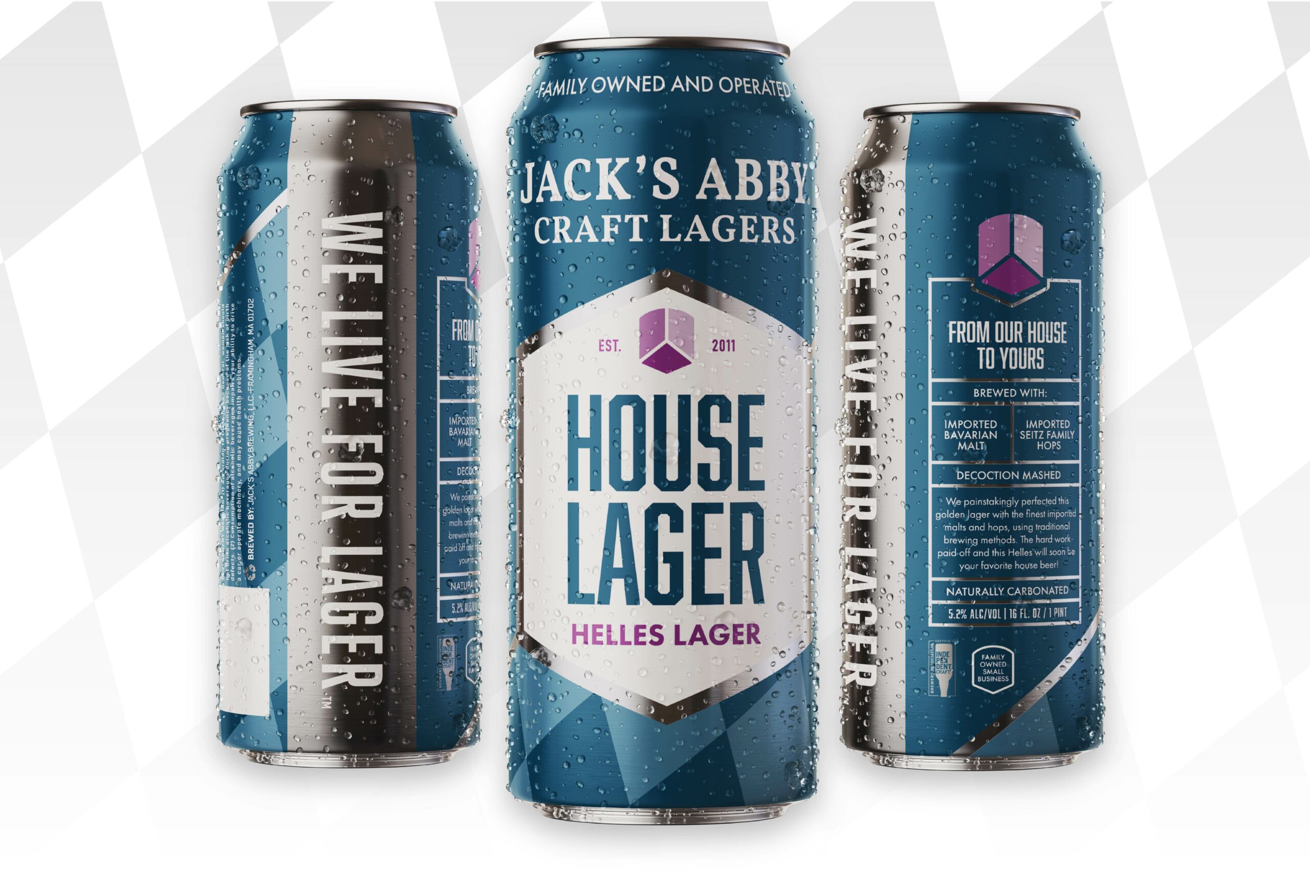
One popular refrain we kept returning to for the architecture of the design was that “there is beauty in simplicity“. We believe in this ethos for our beers and we wanted a package design that better reflected this mentality. To accomplish this we landed on a bifurcated slash that runs diagonally through our iconic nameplate shield. It allows us to have a space for creative expression on one side, and a cleaner area to communicate key details about the beer on the other.
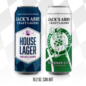
The front face has been unified across all of our beers to clearly and boldly show the Jack’s Abby Craft Lager logo along with “family owned and operated” above a straightforward naming and style convention. This should help clearly communicate what we’ve got in the can even from a quick scan of the shelf.
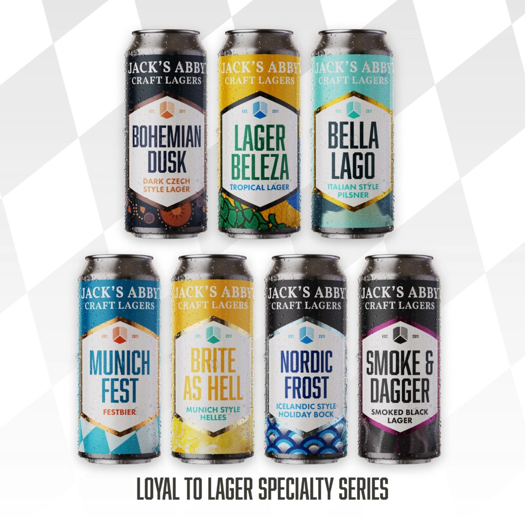
You’ll see across the different lagers how varied the creative canvas can be to the right of the slash. Our traditional lagers feature the iconic Bavarian checker pattern that we’ve always paid respect to. But as you go through some of our specialty products and innovations, you’ll see a world of creative art from our incredible design team. Each pattern tells a story and adds layers of depth to the packaging.
Through this process, we realized that over time some of the painstaking work that we put into making our lagers has been taken for granted. We have not done a good job sharing the details of the process and special ingredients that make our lagers great. So we took this opportunity to make a uniform panel on the left side that clearly organizes key information about each beer.
One of the most unique changes we brought to this design is the aluminum reveal with our WE LIVE FOR LAGER tagline. It may not seem like much at first, but it’s a clever addition that came from a visit to our can manufacturer. Every printed can has a slight overlap area that is necessary for the printing process. But it creates overlapping patterns and colors that aren’t the best looking, and we all do our best to work around that. In this solution, we’ve put the overlap in an unprinted space avoiding that problem completely. We also think it looks pretty cool to hold up a can that screams WE LIVE FOR LAGER from the side!
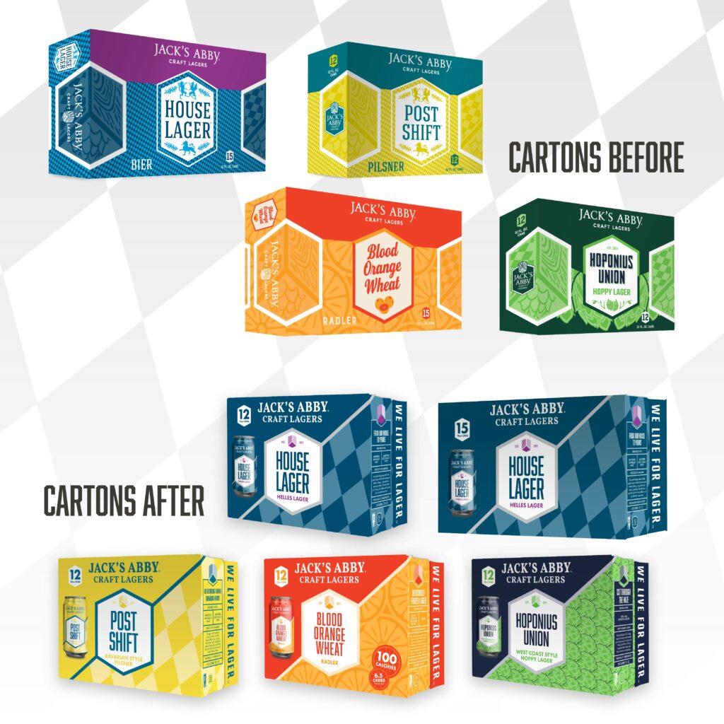
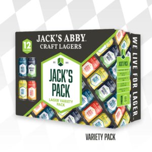
We took this same design architecture to the 12-pack cartons as well. You’ll see the same brand and naming convention along with a bifurcated design instantly. We also created the same clean panel of beer information and of course the WE LIVE FOR LAGER panel. We wanted these cartons to look uniform to the brand and compelling on a shelf full of great design.
The new packaging will be rolling out starting in mid-January and continuing through February. It takes a little time to transition everything, but we’re well on our way, and everything will be looking fresh before you know it.
A lot of hard work has gone into this project so that our outer look best reflects our inner beliefs. This new design is meant to be a welcoming beacon to all who want to LIVE FOR LAGER. Hopefully, you enjoy it as much as we do for years to come.




Cheers