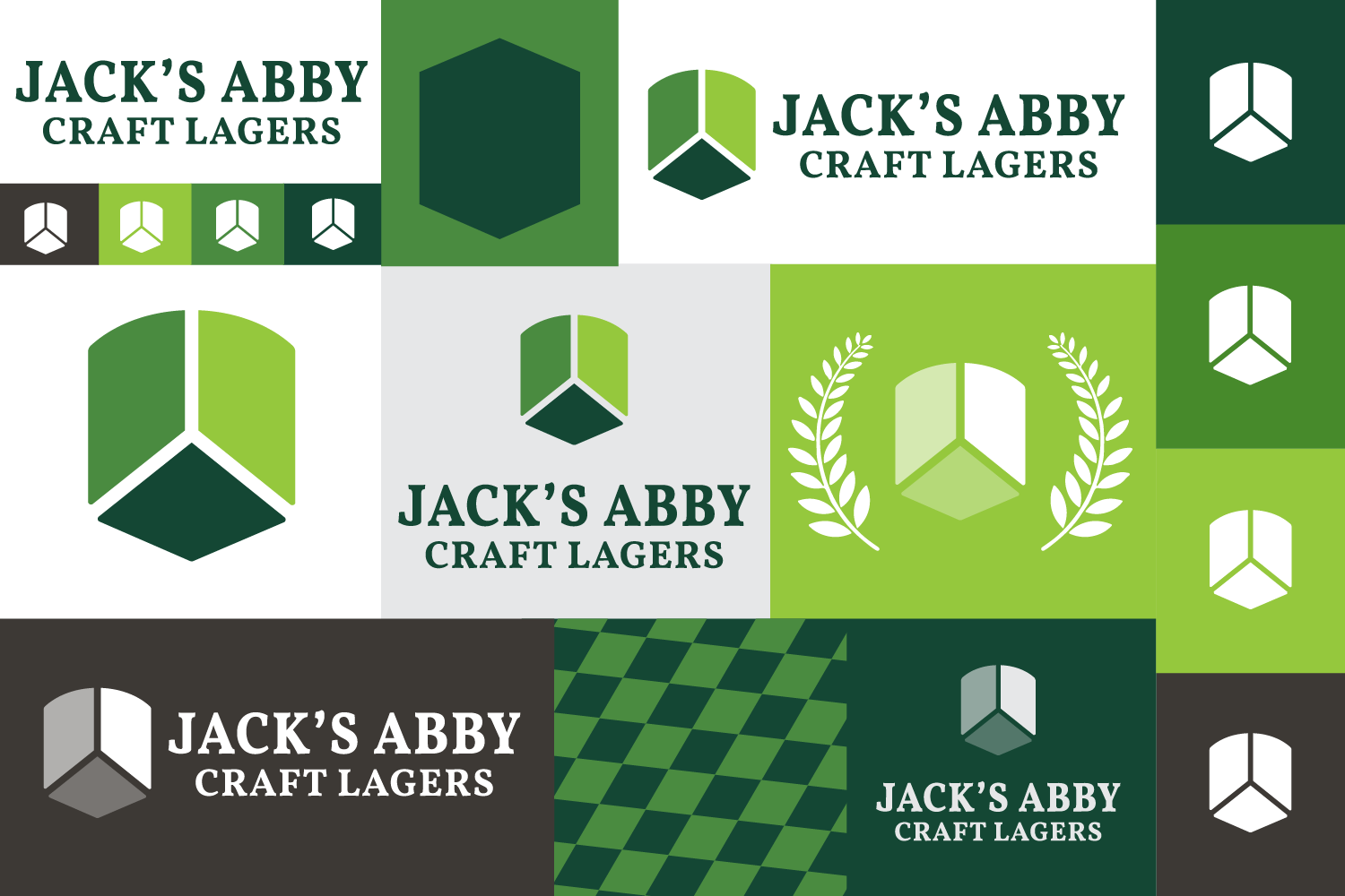
Hi! I’m Katie Hughes, one of the graphic designers here at Jack’s Abby. I’ve had the pleasure of working for Jack’s Abby for the past 4 years and I’ve watched our company grow immensely, paving the way into new territories, expanding our beer portfolios, and reaching more customers like you to share our love of lager. I came into the beer industry fresh out of college, when the haze craze was in full effect. Then, I saw White Claws take over the shelves. There was a pandemic sprinkled in there, and more recently I’ve seen consumers start to trend back to the crisp refreshingness of a lager. Times have changed since I started, so when I was given the opportunity to refresh Jack’s Abby’s iconic branding, I was so excited to give our logo a more modern feel to fit with the modern times.
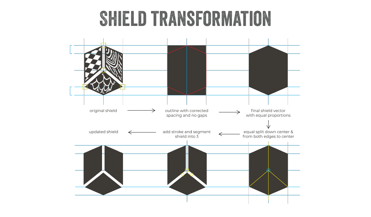
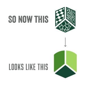
My first step was to tackle the Jack’s Abby shield. Currently, our shield is split into three sections with a different pattern for each section. Wood grain represents barrel-aged beers, the bavarian checker pattern is representative of traditional German styles and brewing techniques, and the hop pattern most obviously represents hops. This logo was complex, detailed, and representative of a time when different elements were more important to our company. 6 years after the original logo was created, we spent a lot of time answering the tough questions – who are we (thanks Zoolander) and what do we stand for? Our key values became a family-owned and operated business focused on creating traditional German-style lagers with a modern twist. Stripping out the dated patterns in the icon we were left with 3 shapes representing the 3 brothers that created Jack’s Abby Craft Lagers. These changes offered a stronger logo icon that would translate better across all mediums and sizes.
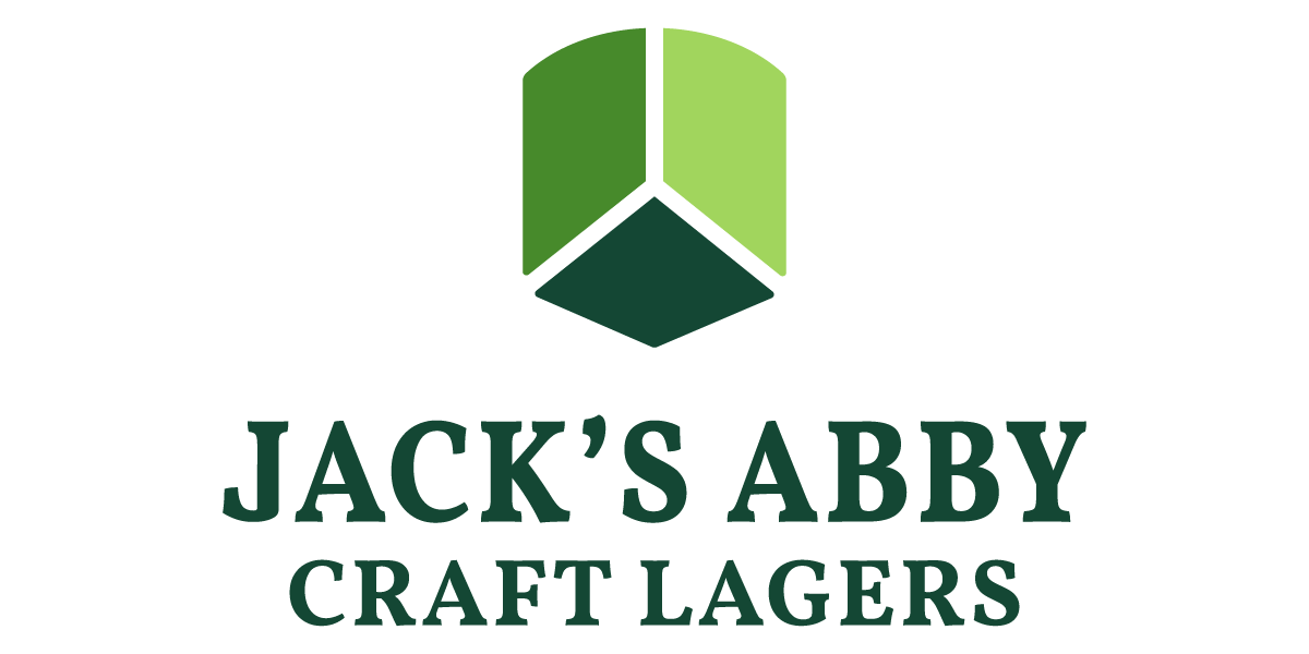
After simplifying the shield, the top was rounded to mimic a fermentation tank which linked the importance of the brewing process to the traditional German shield. Each section of the shield was then filled with a dark, medium, or light shade of green.
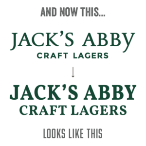
For the text, we wanted to keep the traditional feel, authenticity, and craftsmanship while using a font that felt slightly less dated. The new type treatment is bolder while still looking very similar to the past typeface used in our logo. Along with the tri-shield, this new font is balanced and can stand alone without the tri-shield while still sparking recognition amongst dedicated Jack’s Abby fans.
 We are so excited to share the rest of our refresh with you but for now, this is where I leave you. Thank you for being a Jack’s Abby fan and growing with us throughout these 11 years. There is so much more in store for 2023 and we can’t wait to show you just how much We Live for Lager. Until then, Prost!


